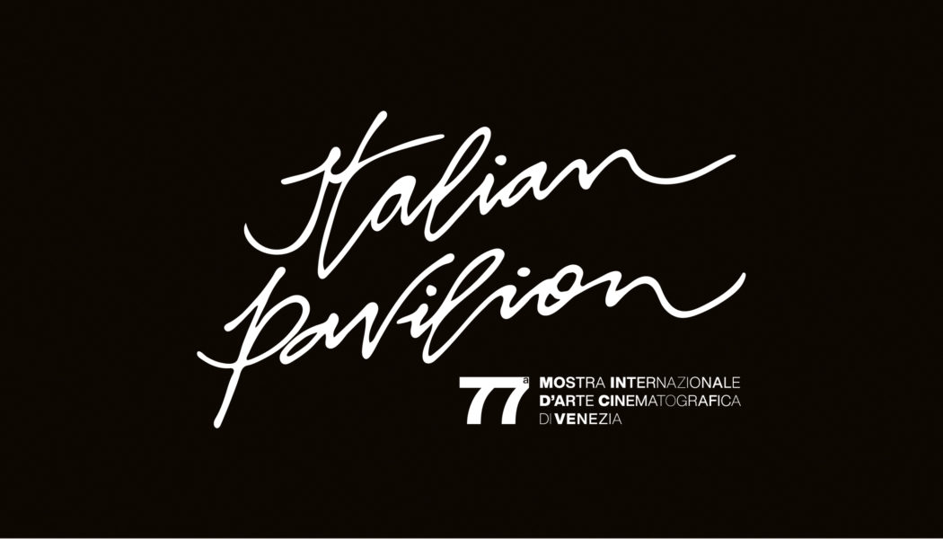
Fellini’s handwriting becomes a typeface and inspires the logo and concept of the installation of the Italian Pavilion of Venice 77.
It is an act of love for Federico Fellini and the dream – that dreamlike dimension that distinguishes the cinematography of the Rimini Maestro – the logo and the unpublished typographic font entitled “Felliniana” combined with the visual identity for the Italian Pavilion of the 77th Venice International Film Festival, scheduled from 2nd to 12th September 2020.
The Italian Pavilion is the “Italian home” of the international event that will be set up as usual in the spaces of the Hotel Excelsior at Lido di Venezia and, from this year, also active digitally through a hybrid formula suggested by the health emergency.
For the third year in a row, Cappelli Identity Design signs the concept and the architectural project of the Italian Pavilion, which for this edition dedicates, on the occasion of the centenary of Federico Fellini’s birth, to the Maestro.
“With the concept of the Italian Pavilion, we immersed ourselves in Federico Fellini’s imagination based on the dream, on that deliberately ambiguous line between reality and dream dimension, so dear to the Master. With Fellini’s script, instead, we got into the heart of his imagination: where writing passes”, explains Emanuele Cappelli, Creative Director of Cappelli Identity Design. “The architectural project revolves around the idea of overcoming the limit through dreams. For this reason we imagined transparent walls, which do not exist, and which, on the contrary, wet by the sun, color surfaces and people. All the work is focused on natural light and its refractions. Taking colors such as light yellow and ochre, emerald green, blue: colors and nuances of Italy’s economic boom that Fellini has translated into the poetry of his film creations and, even earlier, in his previous work as an illustrator”.
Fruit of a journey full of emotions in the world of the Maestro, Felliniana is the font elaborated starting from the director’s handwriting, which Emanuele Cappelli had the opportunity to study live, drawing on the correspondence between Federico and Giulietta Masina, made possible by the meeting with Simonetta Tavanti, Giulietta Masina’s niece.
“With wonder I was able to consult two boxes of letters, many of them of love, with Fellini’s original handwriting, with a soft stroke, projected upwards – says Emanuele Cappelli – We like to think that with Felliniana are written, in addition to the official materials of Venice 77, also the dreams and stories of this new edition”.