Since our establishment in Rome in 1998, RUFA has played a key role in the contemporary scene. Over the years, a corporate image mirroring our identity and core values has developed alongside our growth and brand awareness.
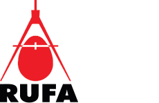
Originally our logo featured a combination of an egg and a compass; geometrically the logo consisted of an ovoid inscribed in and centred on the major axis of an open thumbscrew compass in red and white, that suggested planning and design. The choice of these symbols typically defined the brand of an establishment where art research was associated with the range of creative disciplines: a compass, symbol of professional design, combined with an egg shape, symbolising creation and, therefore, creativity. At the side of the logo – later moved to the bottom – the acronym of our school.
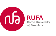
In the years in which RUFA became one of the top Academies in Italy, combining traditional subjects with experimentation, innovation and a focus on the avant-garde, our logo was radically modified by Vertigo Visual Design (www.vertigodesign.it), which opted for a solution consisting of a stylised version of our acronym inside a red circle, the four white letters echoing the concepts of integration, connection, modularity, dynamism and centrality. The logo also featured, at the side, the acronym of the school in capital letters and the name of the school at the top/bottom.
The 2016 logo is an absolutely contemporaneity of the dynamic, lively and vibrant brand, and responsive to the stimuli of the world.
Cappelli Identity Design (www.cappellidesign.com), inspired by the concept of “synaesthesia”, has designed a logo that reflects a continuous contamination between the senses. The logo allows not only to perceive the external environment but to fill it with references and new sensations, which cannot be experienced through a single and separate sensory experience.
The new RUFA logo, in fact, communicates also by responding to sound stimuli and the synaesthesia climaxes when you get to see the sounds and feel the colours and signs generated by this visual identity, a pleasant exchange and a productive sensory inversion.
1990

2010

2016

The new RUFA logo is dynamic with a generative matrix.
Practically, it consists of a fixed and stable – persistent but not motionless – graphic mark, with accompanying letters that strengthen its controlled mutability. In this dynamic system, the letters move and change, creating waves and sound/visual variations within the logo itself. The generative variables may change each time: the number of students present in the Academy at any given time, the number of available study programs, the number of people participating in an event. The changes in our logo are strictly related to RUFA’s life and RUFA itself therefore will generate its logo.

Back to top, activates the microphone sharing and enjoy