The exhibition of the Advanced Training Course in Type Design is inaugurated at RUFA Space.
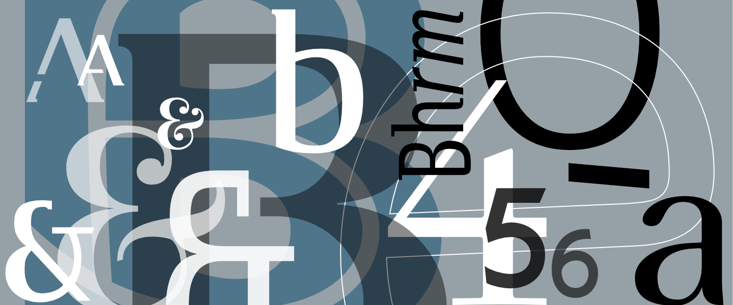
“Putting the world to the world” is the title of a work by Alighiero Boetti from 1972-1973: A blue three-meter diptych made entirely with a biro pen, and at the top, horizontally, all the letters of the alphabet, written in white. The world is made of words, and words are made of letters that bring the world to the world. The letter is therefore the indivisible unity, as claimed also by certain French avant-garde of the last century which, with letters (and not words), would have set the world on fire. If the avant-gardes are now behind us, the assumption according to which in the beginning was the letter, or the sign, is still valid. This exhibition is made of letters that offers the public the result of an advanced training course, the first promoted by Rufa, dedicated to Corporate Type Design, or to “tell the world”, in its diversity, through letters. During 64 hours of the workshop, the students, followed by Antonio Pace, dealt with the design of typographic characters designed for visual identity systems and faced the complexity of a Type Design project: from the sketch on paper and consequent digitization of the single signs , the normalization of alphabets and equipment, ending with the steps of engineering, programming and production of digital fonts. Each student will exhibit a poster (70×100) and a 16th in A5 format that documents the various stages of the work done during the workshop. Each letter is therefore a world and expresses a point of view on the world, which is shown here.
Appointment for the inauguration of the exhibition Alphabet / Corporate Type Design 1 at RUFA Space, Thursday 7 December at 19.30
The course and the exhibition are sponsored by ADI and Aiap.
Thanks to Birra de Borgo and 1sec Tipografia, sponsor of the event.
#Savethedate